Creative direction, book cover, layout, illustrations
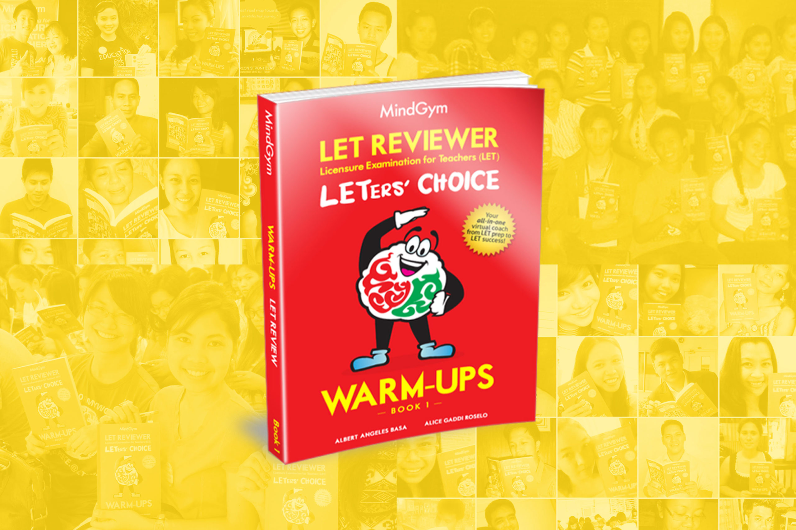
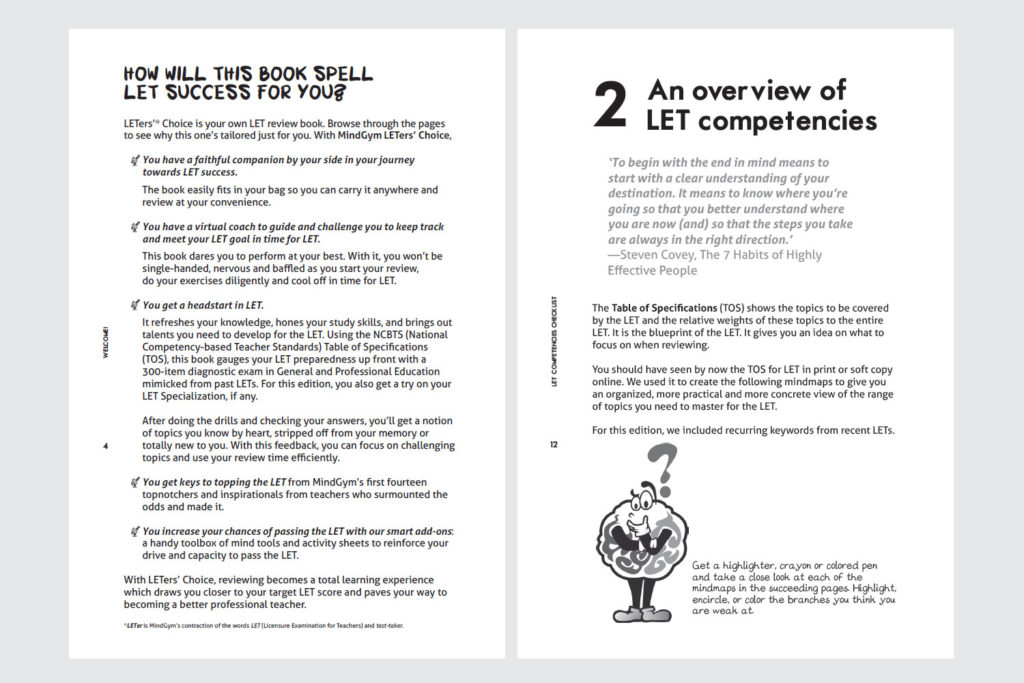
As part of my work in a learning center, I handled the creative visual direction for this published book project, and coordinated with the editorial team to follow our production timeline as closely as we could. This book was part of the center’s licensure board exams review course. It was later made available for retail purchase.
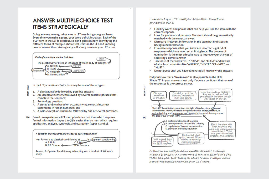
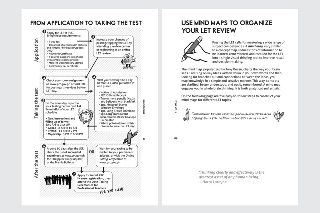
Since this book was meant to be a “personal companion” material to the review course, I used hand-drawn elements to match its warm and friendly tone. I also drew the illustrations throughout its pages.
Following its personal theme, the editorial wanted to make this book be like a “remembrance” for a students’ review time with the center (it’s anywhere between 1-12+ months long).
In order to encourage reviewees to doodle, write notes, and make this book their own, we created several activity pages. Remember your personal doodle notebooks or slambook like the ones passed around in school classes before? 🙂 We also provided spaces for family and friends to leave readers hand-written notes, to accompany them during tough times.
Besides the content, I also designed this book’s marketing collaterals when it went up for retail via their website and several bookstores.
Reviewees all over the country, even from remote islands we couldn’t imagine it reaching, were able to get their copy.
Many of them wrote back to say that they were able to pass their exam and get their license—some even achieving national topnotcher status—thanks to the boost given by a little red book.


