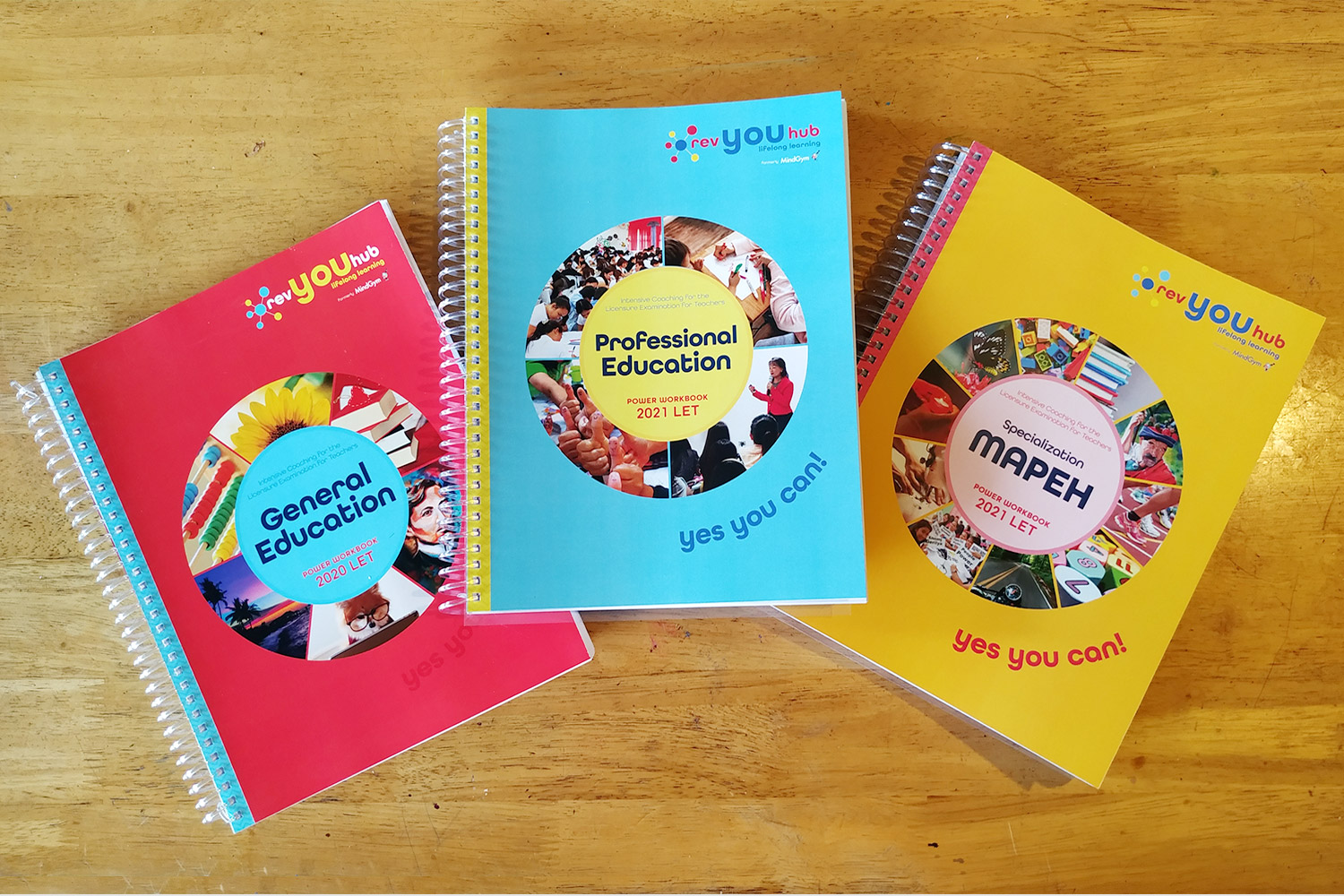
Graphic design, book covers, layout
I handled the graphic design and designed the covers for this series as the center’s in-house designer. These books are used in the center’s review courses.
The cover colors make it easy to distinguish which level of the course they are on.
Photos in the cover circle correspond to the subject content of each book.
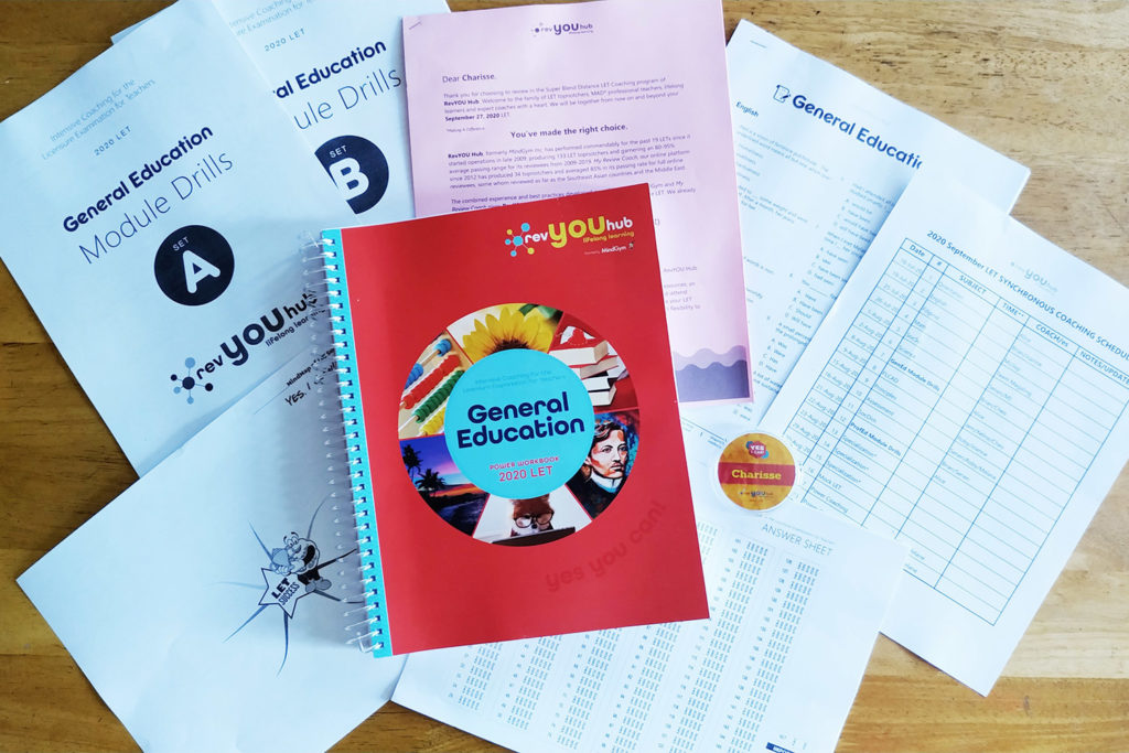
Elements inside the book are also purposely chosen to make it feel friendlier, especially with the amount of information or “blocks of texts” it contains.
Since this start up company is new, I had a free reign to shape how these materials looked like. Inspired by its clean and playful logo, I decided on this bright color scheme and used elements that inspired movement. In a way, it’s helping create the company’s branding for years to come as well 🙂